Though you may want to cram your store full of wonderful products and ingenious displays, Tom Moseman of Envirosell, Inc. — a company that videotapes shoppers to see what they buy or avoid and why — said customers want to be able to find a product quickly and be on their way.
How can you help them get in and out comfortably and still let them see as many toys and games as possible?
Send Them Right
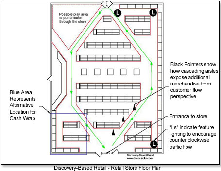
"Given the opportunity, people will move right when they enter a store," said Philip Mitchell, founder of Discovery-Based Retail, a research, design and training company. He cited research by several groups, including Paco Underhill's Envirosell. "If people naturally move that direction, let's encourage them to move that direction."
Mitchell suggests creating "cascading aisles" in the store and designing feature lighting to encourage that movement.
Widen Aisles
"Stores should be spacious," insisted Fred Rosenberg of On the Park Toys and Candy in Kingswood, Texas. "They should have wide aisles for wheelchairs and double-wide strollers."
"According to the Americans with Disabilities Act guidelines, all permanent displays need to be located on an accessible route that is at least 36" wide," Tim Matey, retail consultant for F.C. Dadson, Inc., told TDmonthly.
Round Corners
"A clever trick that can also help strollers get around a store is to use rounded displays. Rounded corners create a path for wheeled objects to follow smoothly," suggested Matey.
"You want your traffic paths to flow like a stream, with natural curves as opposed to sharp turns in the aisles."—Tabitha Miller, certified Feng Shui consultant
Tabitha Miller, a classically trained certified Feng Shui consultant, agreed: "You want your traffic paths to flow like a stream, with natural curves as opposed to sharp turns in the aisles."
Pointed or angled structures imply a source of negative energy, she said. "In a store these sharp corners can come from shelving units, tables and even architectural corners. These can be softened or blocked by the use of plants, fabric and lights."
Mitchell also likened the movement of customers to the flow of water.
"Look at [the above floor plan design] and imagine the store to be a tub of water," he said. "If I were to run my arm around the outside edge of that tub I would start the flow of the water it contained, and then inertia would take over and that movement would likely continue. Remember the invariant right and observe how I have reinforced the counter-clockwise flow of people with feature lighting, cascading aisles and overall design."
Vary Shelf Height
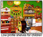 "To avoid creating a claustrophobic vibe," continued Matey, "limit tall shelving to exterior walls and use lower-profile displays around the middle."
Older women prefer to reach items directly in front of them or a little higher, said Moseman, while older men (and kids) are more likely to bend down.
"To avoid creating a claustrophobic vibe, limit tall shelving to exterior walls and use lower-profile displays around the middle."— Tim Matey, F.C. Dadson, Inc.
"If you are a store that caters to smaller children, having lower-profile shelving makes sense," agreed Matey.
Maximum shelf height against walls and at the rear of the store should be 7' to 8', said Ted Baylis of Franklin Fixtures, a fixture company that works with small specialty retailers.
"If they can't see it, they won't buy it," he warned. For toy stores, center shelving should not be more than 5' and is ideally shorter in front so kids can easily look over the first displays to the toys behind them.
Increase Exposure
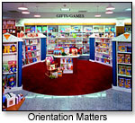 "Imagine walking down the front aisle," continued Mitchell (see Retail Store Floor Plan image above)."Observe the black pointers and see the wide range of products that you would be exposed to. The staggered terminal points of the gondola not only guide traffic, but expose shoppers to wide variety. The exposure continues to pull traffic and only encourages the natural movement of the customers. Natural movement translates to a comfortable shopping experience. A comfortable shopping experience produces a popular store."
"Natural movement translates to a comfortable shopping experience. A comfortable shopping experience produces a popular store."—Phil Mitchell, Discovery-Based Retail
"You want to build height from the front to the back," advised Baylis. "You also want aisles oriented so people can easily look down the aisles."
Baylis claimed that his customers report sales increases of 10 percent to 40 percent after a fixture redesign. "Some of it is excitement generated by new paint and carpet," he admitted, "but much of it is from using fixtures that display the product well."
Place Products Optimally
"Some retailers use a traditional approach of placing fast-selling items on lower shelves," said Shari Waters, retail expert for About.com. "Others prefer to place high-margin products right at eye-level. Determining where to place products depends on many factors, including product assortment, overall inventory, space, promotion, and price."
Position Cash Wrap Strategically
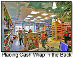 "Impulse items always do well near check outs, but make sure that you keep enough room to accommodate a line," reminded Matey. "Some general guidelines would be not to place the cash register too close to the door or in line with the door," advised Miller. "This is like having your money coming and going without it having the chance to accumulate."
Mitchell agreed in principle, but gave other reasons. Locating the cash wrap directly in front of the entrance or to the right would impede customers' natural inclination to move rightward, he said.
"Therefore, I would avoid locating the cash wrap in either of those two positions," he advised TDmonthly. "I designed this floor plan with the cash wrap near the end of the counter-clockwise circumscription of the sales space to encourage shoppers to peruse the entire sales floor. However, if security is a high concern in the store's locale, an alternate location could be the area that I designated with the blue rectangle (see Retail Store Floor Plan image above)."
One of the stores Baylis worked with positioned the cash wrap in the back, from where the entire store is easily visible.
Stay Simple
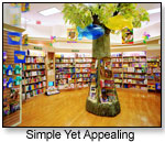 Too often, concluded Moseman, "store design fails the retailer." Your layout must recoup in sales the money invested in design; yet another reason to aim for simplicity.
Baylis agrees that clutter turns off customers, as does untidiness.
"Go look at your store as if you're the customer," he advised. "Are there sticky notes and handwritten signs on doors? Sticky notes on the register? Dustballs on the shelves? If so, get rid of them. People like to see what they want to buy, and they want it to be appealing."
DISPLAYS MOVE PRODUCT
Displays shouldn't just attract the eye; they should encourage shoppers to buy more. Pam Mikula, owner of the online Nature Store told TDmonthly, "Special groupings draw attention in a way that focuses the buying. One thing leads to buying another."
Tell a Story
 "It's about grouping items with a theme," explained Dan Soderberg, former education and exhibit expert at the Maryland Science Center. "We have a NASA tie-in, so we group model rockets, lunar landers [and] Mars rovers together, making little dioramas of various outer-space scenes. The kids get excited, rush over to play with them and want them for their own."
Use Manufacturers
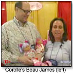 Manufacturers can simplify selling for you by showing you how to display their items to maximize the number of purchases made in one visit. Corolle Dolls, for example, color-codes its dolls, clothing and accessories so shoppers can easily match their new baby doll to the correctly sized dresses, jumpers and baby carriers.
"We find that when people use the merchandise and display items we give them, their sales go up dramatically," said Corolle's North American Director, Beau James. "We're testing a servicing program right now where we'll go into stores to help them use these materials effectively."
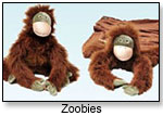 For the Zoobies transmutable pets, "We recommend you set them out in all three stages: plush animal, pillow and blanket," said Hailey Alston of Zoobies.
This same principle could be applied to any toy that might otherwise require demonstration. If a toy isn't moving, contact its maker for merchandising ideas.
Mix Categories
"A really popular trend in retail right now is to create merchandising groups of complementary items to promote cross-selling," said Matey.
A choice often cited by toy-store owners, for example, is to mix plush with books in one display. Folkmanis even includes on their website a list of books that can be paired with their animal puppets. Other examples might include pairing costumes with books or playhouses. You could also add impulse items to higher-ticket displays, to encourage add-on purchases. (see How to Create Displays That Sell)
MAKE COLOR WORK
"Pop" Toys Out
"Although conventional wisdom states that neutral backgrounds are best for display areas, conventional wisdom is not always wise," says Lee Eiseman, leading color consultant, author and speaker for business, in her book Color: Messages and Meanings. "Don't underestimate the impact of darker or more vibrant color as background to make the merchandise 'pop.' And the space doesn't have to be large to have a visual impact. Even the smallest area will benefit from colorful backgrounds as they will always draw the customer's eye."
Try Feng Shui
Miller, a feng shui expert, states that "Every area has its own energy type, categorized by the five elements. So for example, if you have an area in the north section of your store, the watery colors and metallic colors would work best there."
Miller went on to suggest adding pool and swimming toys to that area, to reflect the water element.
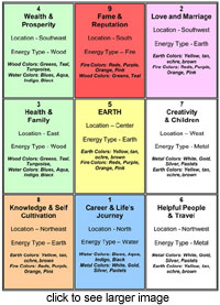 "The Life Aspiration associated with the North is career so another good option here would be toys associated with careers," she continued. "This can be done in many places throughout the store. The East is wood and the aspiration associated is family, so the colors in this area can be wood colors, such as green, and the toys can be family-themed toys, like cooking toys, dress up and playhouses."
ACTION BUILDS EXCITEMENT
One easy way to stop shoppers in their tracks — outside or in — is to attract their eyes with motion. Owner Michael Dark of Something Different USA in England couples bold colors with minimal product display. One Christmas, "I had a window full of Afro-American Santas and choir singers and on another occasion a singing/moving cowboy Santa. It gets people to cross the street!" he said.
Play Videos
Anything moving will capture attention, Geary confirmed. The sense of motion and activity should continue inside the store. Astute retailers have begun placing monitors throughout their stores to play toy demonstration videos that highlight products that might otherwise collect dust. You can also use demonstration videos on your website to help excite interest in toys to facilitate ordering or even a visit to your brick-and-mortar store. (see Getting Great Toy Videos for Your Toy Store and Website)
Set Toys Loose
Other ways of keeping excitement high in the store are running a train on a track or keeping a supply of PlasmaCars and other ride-ons out for customers and staff alike. Terri Bracken, owner of Earth Explorer Toys in Zionsville, Ind., even briefly featured a short video of herself scooting along on a Flying Turtle on her website.
Keep Product Moving
 The simple act of transferring products from one part of the store to another can start them flowing to the cash register.
"Sometimes it's just the display," that's prevented a toy from selling, noted Owner Teneen Dobbs of Kits & Kaboodle in Carmel, Ind.
"Customers are always looking for something new," Kevin Hart, of The Toy Store in Ansley Mall in Atlanta, Ga., told TDmonthly. "We rotate manufacturers by buying from one company one year and another the next. We also rotate the old merchandise so that it will be sure to be seen. We like to hear an excited customer say, 'Wow, I have not seen anything like this before.' "
"Sometimes we will switch out [window displays] every other day during busy vacation weeks," said Smith, who operates in a tourist town.
Keep Them Buying 'Til They're Gone
No matter what the season, some of the most important displays are the point-of-purchase buckets and barrels of inexpensive and unusual toys that kids and parents can't resist picking up once they're at the cash register. These quick add-ons can really add up. In TDmonthly's poll, 86 percent said they changed their POP displays at least monthly and 65 percent did it weekly.
Read more ...
Design a Buying Space, Part III: Analyze and Think Outside the Toy Box
Read previous articles:
How to Start a Toy Store, Part I: Locations, Teams and Business Plans
How to Start a Toy Store, Part II: Find the Right Toys
Design a Buying Space, Part I: Start Outside
Other contributors to this article may have included: Julie Adrian · Michaele Birney Arneson · Leigh Au · Christina Chan · Julia Ann Charpentier · Elizabeth Chretien · Virginia Davis · Laurel DiGangi · Zan Dubin Scott · Lisa Durante · Cicely Enright · Margaret H. Evans · Doug Fleener · Diane Franklin · Janie Franz · Dennis Foley · Dennis Furlan · Rosette Gonzalez · Elizabeth Greenspan · Mort Haaz · Sharri Hefner · Terri Hughes-Lazzell · Kyle Hall · Pennie Hoover · Sheri Jobe · Julie L. Jones · Candyce Kornblum · Christine Lebednik · Susan Ledford · Chris Lundy · Susan Maddela · Hans C. Masing · J.D. Meisner · Adeena Mignogna · Catherine Jo Morgan · Claudia Newcorn · Willow Polson · Marie Raven · Kara Revel · Andrew Robinton · Greg Rock · Brenda Ruggiero · Tamara Schuit · Brent Turner · Vanessa VanderZanden · Jodi M. Webb · Stacy Wiebe· Mark Zaslove · Alex Zelikovsky


 "To avoid creating a claustrophobic vibe," continued Matey, "limit tall shelving to exterior walls and use lower-profile displays around the middle."
 "Imagine walking down the front aisle," continued Mitchell (see Retail Store Floor Plan image above)."Observe the black pointers and see the wide range of products that you would be exposed to. The staggered terminal points of the gondola not only guide traffic, but expose shoppers to wide variety. The exposure continues to pull traffic and only encourages the natural movement of the customers. Natural movement translates to a comfortable shopping experience. A comfortable shopping experience produces a popular store."
 "Impulse items always do well near check outs, but make sure that you keep enough room to accommodate a line," reminded Matey. "Some general guidelines would be not to place the cash register too close to the door or in line with the door," advised Miller. "This is like having your money coming and going without it having the chance to accumulate."
 Too often, concluded Moseman, "store design fails the retailer." Your layout must recoup in sales the money invested in design; yet another reason to aim for simplicity.
 "It's about grouping items with a theme," explained Dan Soderberg, former education and exhibit expert at the Maryland Science Center. "We have a NASA tie-in, so we group model rockets, lunar landers [and] Mars rovers together, making little dioramas of various outer-space scenes. The kids get excited, rush over to play with them and want them for their own."
 Manufacturers can simplify selling for you by showing you how to display their items to maximize the number of purchases made in one visit. Corolle Dolls, for example, color-codes its dolls, clothing and accessories so shoppers can easily match their new baby doll to the correctly sized dresses, jumpers and baby carriers.
 For the Zoobies transmutable pets, "We recommend you set them out in all three stages: plush animal, pillow and blanket," said Hailey Alston of Zoobies.
 "The Life Aspiration associated with the North is career so another good option here would be toys associated with careers," she continued. "This can be done in many places throughout the store. The East is wood and the aspiration associated is family, so the colors in this area can be wood colors, such as green, and the toys can be family-themed toys, like cooking toys, dress up and playhouses."
 The simple act of transferring products from one part of the store to another can start them flowing to the cash register.