 |

Tools:


Get Online Before It's Too LateHow to Build Your Virtual "Store"
Customers searching for a nearby toy store more likely turn to Google, Yahoo or Bing than the phone book, so if you're not on the web, you're losing foot traffic as well as online sales. While many small-business owners dream of millions of credit-card sales from their online stores, more realistically, the majority find a website to be a consistent advertisement. Using social networking sites, such as Facebook and Twitter, helps keep you in contact with customers but won't necessarily translate directly into sales.
 Sixty-five percent of the 39 retailers TDmonthly Magazine surveyed have an online store component; however, only six reported significant sales (roughly 30 percent or more) from the website. The rest reported sales of 5 percent or less. Sixty-five percent of the 39 retailers TDmonthly Magazine surveyed have an online store component; however, only six reported significant sales (roughly 30 percent or more) from the website. The rest reported sales of 5 percent or less.
"It’s just a business card site,” Paul Faustine of Red Dragon Toys in Brunswick, Maine, told TDmonthly of his store’s online presence. “Yellow Pages don't work anymore."
A NEW DEMOGRAPHIC
"People's offices are your retail outlets and that's where you need to appeal." — Valerie Pontbriand, Four Eyes Joke Shop
Valerie Pontbriand, former owner of Four Eyes Joke Shop, noticed that her online customers had very different habits than those who would stop by her brick-and-mortar store.
"I [could] see when people shop," she told TDmonthly. "They shop for an hour before lunch, then go to lunch and come back and check their orders after lunch, or buy more after lunch. People's offices are your retail outlets and that's where you need to appeal."
 THE ILLUSIONARY STORE THE ILLUSIONARY STORE
Just because you need to be online doesn't mean you should rush and slap up something fast and cheap.
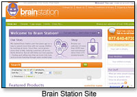
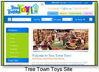
"There's an old adage among magicians: 'The audience may not know how to do a magic trick, but they sure know bad magic when they see it,' " offered Hans C. Masing, co-owner of the online Brain Station (Fig. 10.2) and the brick-and-mortar Tree Town Toys (Fig. 10.3) in Ann Arbor, Mich. "Similarly, your potential customers may not know how to build a website, but they'll know a bad one when they see it. When you put up a website, you are creating an illusion of your store on the Internet."
Save yourself time (and your customers confusion) by keeping things simple, advised Rick Segel, author of "The Essential Online Solution: The 5-Step Formula for Small Business Success." Ninety-three percent of browsers will hit the "Skip Intro" button on home pages that feature music, animation and other bells and whistles, he said.
 "That's a pure waste!" he stressed, calling the return on investment "insignificant." "When people are searching the Web at work, the last thing they want to hear is someone screaming with music going. It can turn people off!" "That's a pure waste!" he stressed, calling the return on investment "insignificant." "When people are searching the Web at work, the last thing they want to hear is someone screaming with music going. It can turn people off!"
"Users do not want music, sound, animation or flash images," as those elements can be annoying, C S Wurzberger, Founder and President of Premiere Web Services in Portland, Maine, told TDmonthly. Such bells and whistles can also slow customers' loading time. In order to properly brand a website, she added, all the components "should match so it looks like everything belongs to the same family."
Learn the Basics
"To sell online you should learn something about Web technologies and how they fit together," advised Masing. "Good overviews can be found on sites such as How Stuff Works."
Invite Emotions
"What do customers experience when they walk into your store?" asked Masing. "Do they feel a sense of wonder and excitement? If you can produce a positive emotion with the design of your website, it will encourage customers to use your site and return."
Don't Crowd
"If you think of any store experience you have ever enjoyed, it feels luxurious," Chris Drummond, a visual designer in Monroe, Mich., told TDmonthly. "There are islands of products with space and paths between them. In a dollar store, there is clutter, no path, and the experience feels cheap. Cluttering a Web page causes customers to feel crowded."
Get Personal 
"You want to create an emotional attachment to your business on your website to differentiate you from a larger supplier," said Segel.
He suggested adding photos of the owner and/or staff, as Fred Rosenberg from On the Park in Kingwood, Texas, has done. An "About Us" section that highlights the distinctiveness of the store's history helps connect customers (see The Wizard's Chest in Denver and Heights Toy Center in Little Rock, Ark.) Other ideas include adding a blog, featuring a "handwritten" signature ("it gives a warmer feeling," noted Segel) and adding testimonials from customers, as we do on TDmonthly.
Be Logical
"If people can't get through the site or find the information or products they want, they won't use the site again." — Mindy Schlegel, Lightsky
"If people can't get through the site or find the information or products they want, they won't use the site again," said Mindy Schlegel, account manager for a Goshen, Ind., Web developing and designing firm, Lightsky. "Think carefully about the content to make it useful."
"Customers should be able to find anything on your website in about three clicks," continued Masing. "Your website should cleanly guide customers to the right information, with consistent navigation links on each page and clear indications of where they are relative to the main page. These navigational 'breadcrumbs' allow your user to navigate back through your site, and always know where they are in your catalog."
Permit Searching and Browsing
"How many customers tell you they are 'just looking' when they enter your store?" asked Masing. "How many say they've come for a specific product? Online, both behaviors must be supported. A search form allowing customers to find content is just as important as good navigation links. If your customers can search your product offerings by name, keywords, the brand, or other attributes, they are more likely to find what they are looking for and more likely to purchase."
 Be Transparent and Visible Be Transparent and Visible
Masing also suggested adding your phone number, address and store hours to every page, since search engines can direct customers to any page on your site. Only clients who already know you will go straight to your home page.
He also advised against providing just an email form on your "Contact Us" link.
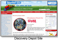
"Customers don't want to feel that they are separated from the retailer," Sherrie Cannon, owner of Discovery Depot (Fig. 10.5) in Cookeville, Tenn., explained. "Having your telephone number and store hours on every page allows customers to feel connected."
Make Buying Easy
All of the information a customer needs to enter — shipping address, billing address, credit card info, etc. — should be on a single screen. In addition to having simple, quick-loading pages and standard button names, "let your customers know what the shipping costs are before they're at the end of the checkout process," Wurzberger advised. And post product photos that are "optimized for the Web," she added. It may be helpful to utilize high-quality thumbnail images that, when clicked, open up a larger picture.
Go Info Only
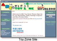
If you don't have the resources or time to manage a selling site, at least put up a simple site with the store's logo, contact info and hours with a map and photos. However, once online you may have to expand. Toy Zone (Fig. 10.6) in Rochester, Minn., began with an information-only site to advertise special events and sales, but subsequently expanded to online selling.
 SEO With Blogs SEO With Blogs
Experts such as Segel and Scott Allen, managing partner of Link to Your World, LLC, a consulting firm that helps companies transform virtual relationships into real business, advise specialty retailers to set up blogs on their websites.
"Blogs help drive traffic in a couple of different ways," said Allen. "They attract people who are passionate about the topic and want to learn more. Once these users discover your blog, they will become repeat visitors, link to it from their blogs or forums, share the link with friends, etc.
"The second main benefit regarding traffic is improved natural search rankings," he continued. "By creating more unique pages, you have more opportunities in the search engine and since each page/post is tightly focused on one particular topic, you have better search engine optimization (SEO) for that topic. Also, people will tend to link to individual posts using either the post title or the topic as keywords in the link, again improving your SEO."
"Half of your blogging time should be allocated to reading other bloggers, commenting on their blogs, participating in other forums and social networks, and linking to other sites." — Scott Allen, Link to Your World
Solicit Feedback
It’s simple to send an email to friends and family to ask them to review your website. You should also request feedback from strangers, to ensure unbiased responses.
Broadcast It
“We have 3,200-plus emails that we do broadcasts to with links to our website,” Cathy Albro, owner of Creative Learning Toys in Grand Rapids, Mich., told TDmonthly.
Make Sure It’s Compatible
Ensure that your website works in different Web browsers. Use a free website, like www.anybrowser.com, that lets you paste in your Web address and provides information on compatibility issues.
BE REALISTIC
"The problem with independent stores is they put a site up and think it doesn't work," noted Segel. "A website takes time to develop."
Rather than viewing the site as a place for sales, said Segel, it's a better approach to view it as a data-collection mechanism.
"It's better to sell a $3.00 toy and get information on the customer to market to him again than it is to get $500 and never see him again," he stressed.
Set Goals
"Know what you want your website to do and how you want people to interact with your site," suggested Schlegel of Lightsky. Being clear about your vision allows a Web designer to establish a site that meets your expectations and your customers' needs.
"Getting people to go to your site isn’t the main goal," said Jon Schallert, a retail expert. "The main goal is getting them to go to the store’s website, capturing their database information, (specifically their name and email address) and then, in the moment that they are there, creating a bond with them where they see that your business is a one-of-a-kind place that deserves repeated visits."
Have an email-registration for your newsletter on each page of your website so you can increase your chances of capturing visitors' information.
Know Your Audience
Schallert stressed the importance of knowing who you're speaking to on your site. They need to have a reason to come back to you and to you alone, since you are competing with thousands of other online toy stores.
"You must position yourself as the only place where they can get the product, service, advice, price and leading-edge information, before anyone else," he continued. "This is what is called creating your 'Consumer Hook'.”
Schallert said you must ask yourself why someone would choose your site over someone else's. "Once you have answered this question, you can complete the loop by driving customers to your site, and then, back to your store," he said.
Providing content pertinent and interesting to your audience, such as child-raising tips for young parents, or gift ideas for grandparents, helps your website seem friendly and helpful.
"Over time, this non-selling dialogue is more inviting, and provides more value to consumers," summed up Schallert. "They, in turn, will visit the site more frequently."
Select Product Carefully
You probably can't sell every item in your store online, so Wurzberger advises store owners to "look at shipping and competition and pricing" to determine what to include. When doing so, remember that the Internet puts your store on a worldwide scale.
Allocate Sufficient Time
Even after you've set up a blog on your site, "in most cases, results will not be immediate," stressed Allen. "If you're not prepared to commit to it for at least six months — whether it seems to be working or not — don't even bother. If you don't see results, don't quit — just mix it up. Try something new. Get some outside input. ... A retailer needs to commit at least six to 10 hours a week for six months. If you can spend more time, great — and the more you spend, the faster you'll see results."
"Even more important than the amount of time," continued Allen, "is how you spend it. Half of your blogging time should be allocated to reading other bloggers, commenting on their blogs, participating in other forums and social networks, and linking to other sites."
"About 50-50 seems to optimize the benefits," said Allen. "Too much time publishing and you don't grow your readership, generate inbound links, etc. Not enough content and there's nothing to keep people coming back for more."
Capture Your Customers
The main goal of a website is not to get people to go there, said Schallert, but to get them to go there and then capture their contact information while simultaneously establishing a bond, so they perceive your business as a "one-of-a-kind place that deserves repeated visits."
"If you can capture an email address of a prospect or customer, you have just eliminated 90 percent of your marketing costs reconnecting to them, and you will be using the lowest-cost, highest-response form of marketing (i.e., email newsletters) to maintain the relationship," said Schallert.
Update and Offer
Schallert advises retailers to think of themselves as manufacturers and to post new releases on their websites to keep customers engaged. Offer discount coupons for these new toys, events and previews that drive customers back to your store.
Evaluate Your Results
How much do you spend managing the online store, including fulfilling orders? This can tell you how valuable your online store is. There isn’t a single answer, but if your online store contributes less than 5 percent of your sales but requires more than 10 percent of your time, it might not be worth it. More than a third of the retailers TDmonthly spoke with reported that their biggest challenge was finding the time to manage the online store.
Jeffrey Boldt of A Planet’s Wild in Muscatine, Iowa, found that the sales from his store’s website were “just not enough” when compared with his brick-and-mortar sales, he told TDmonthly.
Do you know how many people visit your website and which pages are most popular? Tracking which pages are visited, when, and by how many people will help give you an idea of what to tweak. See Google Analytics to get started.
Other contributors to this article may have included: Julie Adrian • Michaele Birney Arneson • Leigh Au • Christina Chan • Julia Ann Charpentier • Elizabeth Chretien • Virginia Davis • Laurel DiGangi • Zan Dubin Scott • Lisa Durante • Cicely Enright • Margaret H. Evans • Doug Fleener • Diane Franklin • Janie Franz • Dennis Foley • Dennis Furlan • Rosette Gonzalez • Elizabeth Greenspan • Mort Haaz • Sharri Hefner • Terri Hughes-Lazzell • Kyle Hall • Pennie Hoover • Sheri Jobe • Julie L. Jones • Candyce Kornblum • Christine Lebednik • Susan Ledford • Chris Lundy • Susan Maddela • Hans C. Masing • J.D. Meisner • Adeena Mignogna • Catherine Jo Morgan • Claudia Newcorn • Willow Polson • Marie Raven • Kara Revel • Andrew Robinton • Greg Rock • Brenda Ruggiero • Tamara Schuit • Brent Turner • Vanessa VanderZanden • Jodi M. Webb • Stacy Wiebe• Mark Zaslove • Alex Zelikovsky
 Writer's Bio: Writer's Bio: ALISON MAREK is an award-winning writer, director and cartoonist whose work has been published by Fairchild Publications and DC Comics (Piranha Press), broadcast on Showtime and other cable networks, and viewed worldwide in film festivals. See her short films and print work on www.alisonmarek.com. Watch her nefarious villains in the web series www.MuggsMovers.com. Get inspired by her cartoons "Daily ARFFirmations to Unleash Your Inner Fido" at www.ARFFirmations.com. Phew! And then ... Read more articles by this author
THIS BANNER IS AN AD:

• • • • • • • • • • • • • • • • • | • • • • • • • • • • • • • • • • • |
Back to TDmonthly's front page
|  |
Advertise on TDmonthly

|

